The importance of a mobile-ready website.
It can be tough to keep up with the changing times and promote your shop online. One thing that doesn’t change is the need for a mobile-ready website. Our recent research of over 450 aftermarket auto restoration, performance and restyling shops online had some surprising revelations: over
40% of shops don’t have a mobile-ready website - which is truly shocking.
Having a website is excellent, but so many people are accessing the web from the comfort of their phones these days. Based on data compiled by Statista, in 2021 83% of the U.S. population uses a mobile device to access and search for products and services on the internet, and it's expected to be 87.66% by 2026. So having a mobile-friendly website is incredibly important - it can be the difference between signing on a new project or losing them to the competition.
If you’re a shop owner and your website doesn’t work well on mobile, then you could be losing out on new clients.
Why Mobile-ready?
There are many reasons why you should make sure your website is mobile-ready, not just to make it easier for your customers to access your site, but also to ensure that you always look professional.
A mobile-ready website tends to have more page views per visit, plus it has a lower bounce rate, which basically means people spend more time browsing on your site and learning more about your products and services.
Mobile devices, such as phones and tablets, are also often used for researching products and services before a consumer decides to commit. So before they even consider working with you, they’ll check your website to see what your company is all about.
We’ve spoken to a number of shop owners over the years and they tell us that they get most of their work via referrals. While that’s great, you can bet the majority of those referrals will almost always check out your site before committing to a product or service.
Your audience will want to see what each shop offers, as well as the products and services you offer so they can make an informed buying decision. Sometimes it’s just way more convenient to browse businesses on a mobile device than on a computer.
Prospects can browse while working on their project in the garage or while at a car show when inspiration hits. Having a mobile ready website means that when a client sees your work at a show, they can find you easily on their phone and learn about the company behind the badass ride they're looking at.
More often than not, people will use their mobile phones to have a quick scan of your website to make their minds up and then switch to a desktop to contact you.
Pro Tip:
If your website isn’t mobile-friendly, your users might not even be able to find you on Google. This is because Google ranks sites that are mobile ready higher than those that are not mobile ready or poorly designed.
Are You Already Mobile-Ready?
The easiest way to figure out if your website is mobile-ready is to view your site on a smartphone or iPad device.
Does it look alright on your phone, or is it cut off? Do you have to zoom in to read the content? Is the text hard to read? Are the buttons or links challenging to click?
If so, there’s a good chance that your website isn’t mobile-ready, and you could be losing clients because of this.
If you don’t trust your judgment, you can always ask a friend to take a look at your website for you. Google also offers a free service where you can
test your website to see if it is mobile-friendly.
It’ll tell you if your:
- Content is wider than the screen
- Links are too close together
- Text is too small to read
- Videos play okay
- Images are readable
We recommend figuring out if your website needs updating as soon as possible. The quicker you make your website mobile-friendly, the fewer potential clients you’ll lose.
Pro Tip:
Having a mobile-ready website means having a website that loads quickly so make sure that your website loads within 3 seconds.
53% of mobile sites are abandoned by users if they take longer than 3 seconds for the site to load.
Maximum Effectiveness
If your website isn’t mobile-ready, then you’re going to end up losing customers; that’s just a fact. But having a mobile-ready website doesn’t just improve your chances of retaining customers. It also has a lot of other benefits too.
Here are five more benefits of having a mobile-ready website:
1. Customers Come Back for More
If people can easily access your website from the comfort of their phone without any stress or issues, then they’re going to revisit your website. They’ll regularly check on your site to see if you’ve added anything new or to check out your latest projects.
It’s easier for them to search for you on their mobile device from anywhere than turn on their laptop or desktop. So if you provide them with a space to see all your work from their phone or tablet, they’ll have no issues finding you again.
Pro Tip:
80% of smartphone users will buy from companies with easy-to-navigate mobile sites. So, by giving them a mobile-friendly website to view over a complicated one, they’ll stay on your site longer and they’re also more likely to work with you.
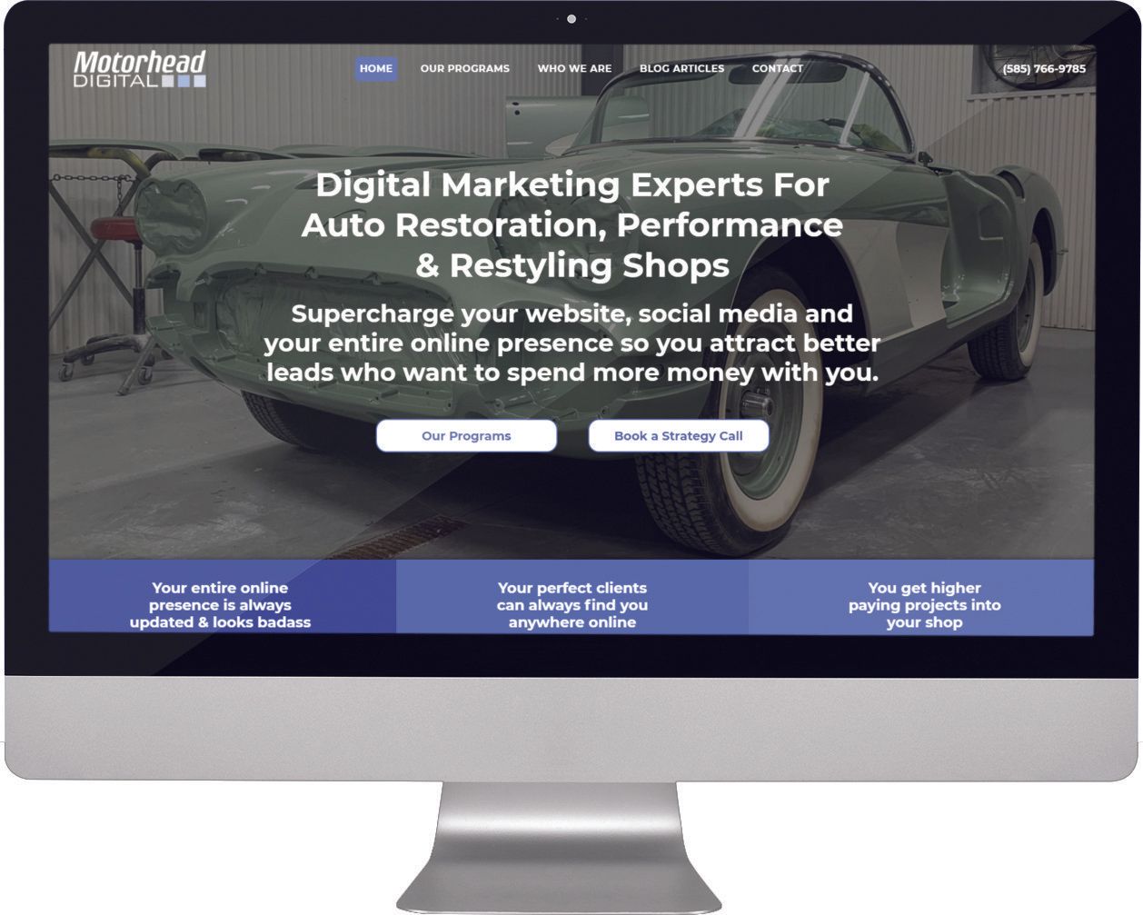
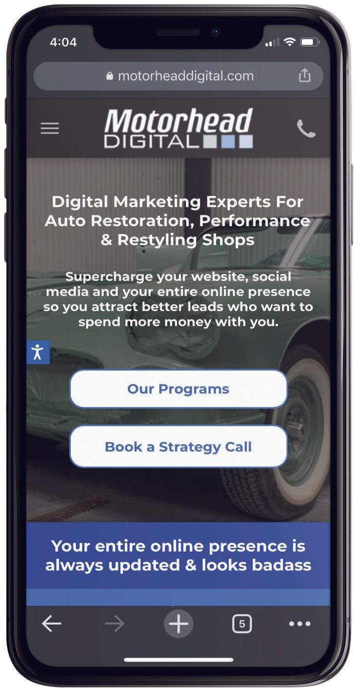
A quality mobile-ready website conveys a professional image and allows users to find information quickly and easily, whether on their home computer or mobile device.
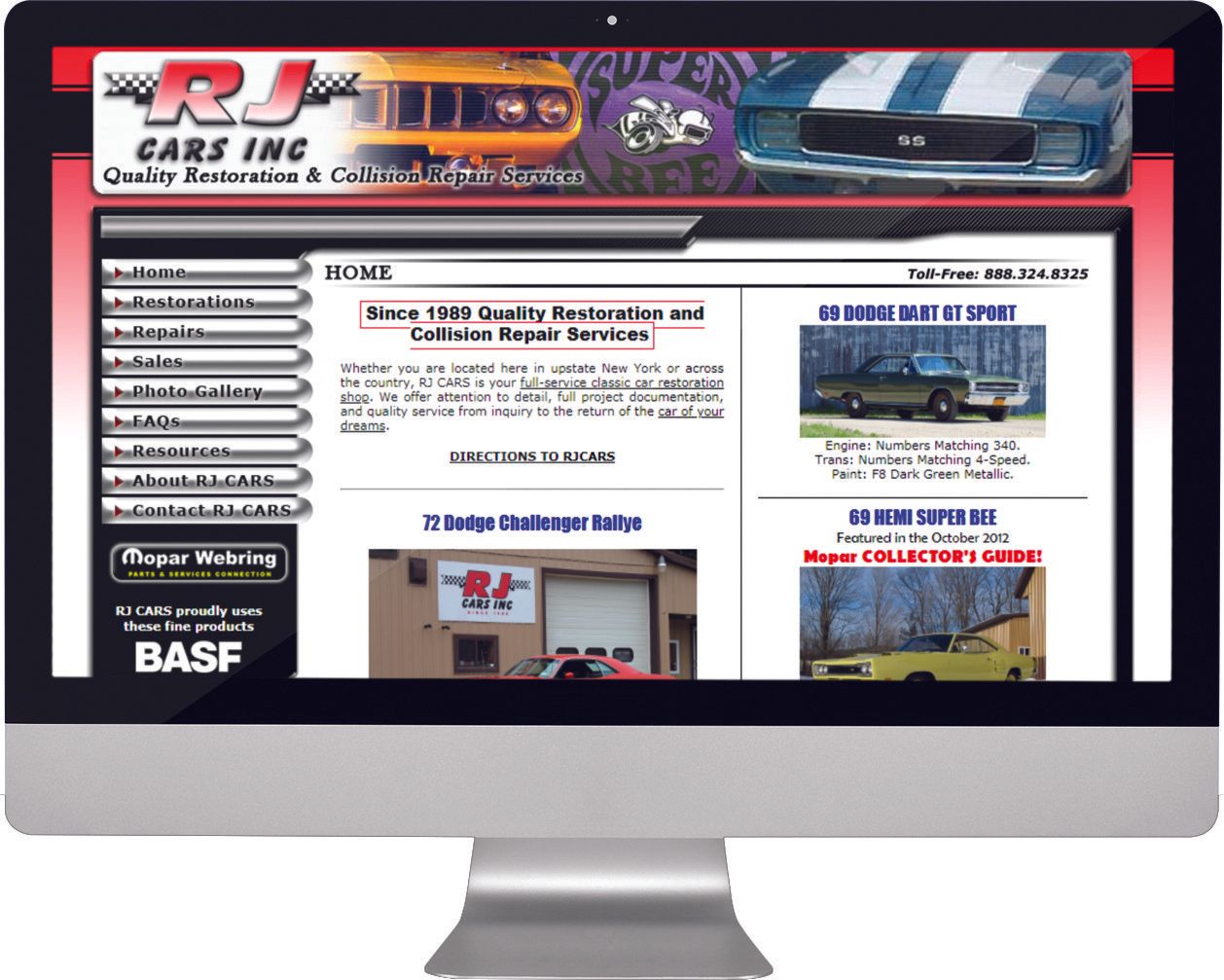
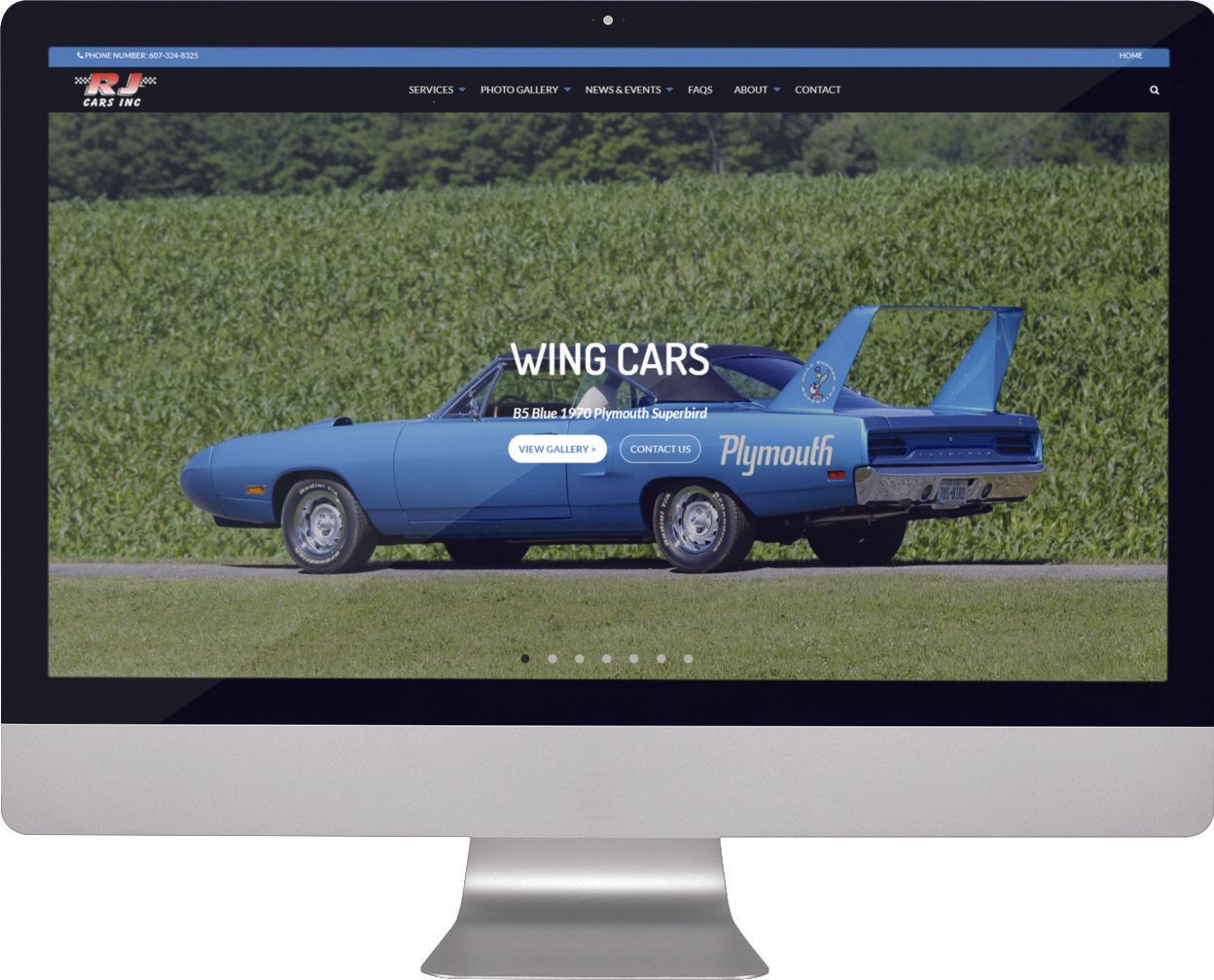
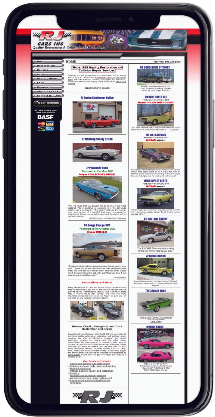
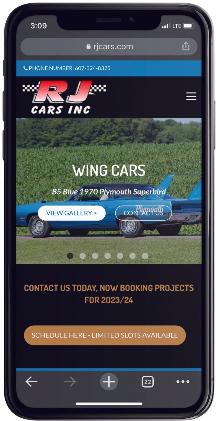
Here's a before-and-after look at the website of one of our clients, RJ CARS. The new, polished site design is a much nicer showcase for the quality work the shops produces.
2. Reduced Bounce Rates
People will leave your website quickly if it looks terrible on their phone. They’ll leave if they can’t read your text, view your images, or navigate your site with ease.
If your website looks great on small mobile devices and your user doesn’t need to zoom in to read your text, then they’ll stay on your site longer, and even watch a video, read some of your blog posts, browse more of your products or check out your projects galleries.
Navigation also has to be easy on mobile; otherwise, they’ll simply decide not to call you.
Make your navigation as simple and stress-free as possible so your user can quickly fly through your website and find everything they need from the palm of their hand.
Keeping your prospective customers on your site longer is proven to increase conversion rates.
3. Improved SEO Rank
Google loves mobile responsive sites because users prefer mobile-ready websites. If you have a website that works perfectly on mobile, then you’re going to appear higher on the search results.
However, if you don’t have a mobile-ready website, then your site might get penalized by Google and moved lower down the search results or, worse...the second page!
The more traffic you get to your website because your site is easy to use on mobile, the more Google will love you and the higher on the search engine results page you’ll go, so make sure you have your site perfected for mobile.
4. Attract More Clients
With a site that doesn’t work well on mobile, your visitors will run for the hills and most likely to the competition.
They don’t want to work with a shop that has a terrible mobile website. It looks unprofessional, and they might automatically assume that because your website is amateur, so is your business as well as the products and services that you offer.
So by making your website mobile-ready, you’ll be able to attract more clients to your business and, in turn, make more sales.
The new design is, of course, 100% mobile-friendly, giving potential customers an easy-to read, easy-to-navigate experience on their phones or iPads.
5. Improved user experience
Having a mobile-responsive website means that your website is going to have a better user friendly design.
By improving your user experience and hence the customer journey, you’re going to increase the number of happy clients you get into your shop.
The happier your clients, the more positive reviews they’ll leave about your website, and the more clients you'll attract.
For those that rely on social media to promote their business should also know that
80% of social media browsing is done on mobile devices, so when they click a link that goes back to your website, they’ll be much more likely to stay and convert if the mobile website experience matches that of the mobile social media app they just came from.
Pro Level


